our logo
Logo Meaning
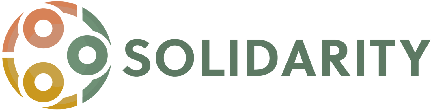
The name “Solidarity” was first used to name a group of college students trying to live out their faith by loving others well. The word describes a ‘mutuality of things and/or people.’ It is the idea that people need one another—the whole cannot exist without each person linking arms with one another. The Solidarity logo therefore, depicts this imagery, an overhead view of three people (each circle an individual’s head) huddled, with arms around one another’s shoulders. As a faith-based organization, the logo is also meant to depict a trinitarian focus, a reminder that even the Father, Son, and Holy Spirit exist in a deep, trusting, mutual relationship that is centered in love.
Due to the demographic of our neighborhoods, there are many who will look at the communities and quickly judge it, taking the lazy route and describing the communities by the harmful labels they typically get. However, once you enter the neighborhoods and form meaningful relationships, you begin to see the depth and the beauty of the Mamás programs, meet the children in the after-school programs, engage with the clients at Camino and hear each person’s God-given story. With this much fullness, you cannot help but want to link arms with them. The meaning and logo of Solidarity is a reminder that we have a chance to do something together, that instead of an “us” and “them”, there is only a “we.”

20 Year Reflection
The past 20 years have been filled with ups and downs, but through it all, Solidarity has seen how God has cared for these two communities for a purpose that goes beyond what we could have imagined. Though we began as a group of wide-eyed, idealistic college students trying to do “good” for a community, we became an official nonprofit that has refined the way we engage the community, desiring to see our neighbors’ dreams and goals become reality. What we are constantly reminded of, is that we would not be where we are now without the strength and hospitality of the leaders and families in the neighborhoods. They did not need to let us into the community 20 years ago, but because they graciously did, we can see how much God has done to transform the community.
As we move away from a season of empowering our neighbors (as if Solidarity ever had the power to give to the neighbors in the first place), we are entering a season of amplifying those that God has already equipped. Our hope in 2022 and beyond is to contribute to our neighbor's definition of flourishing, instead of prescribing what we may have felt flourishing should be. Join us as we live out God’s mission of loving our neighbor!

our Brand
Download our logo


Main colors

Light Green
HEX #5d7963
RGB - 93, 121, 99

Nugget Gold
HEX #CA981E
RGB - 202, 152, 30

Coral Gold
HEX #D78257
RGB - 215, 130, 87
Fonts
Header: Oswald, All caps
Subheader: Montserrat
Paragraph: Quattrocento